Amrith Muhundan

Foundation Diploma in Art, Design & Media Practice - Canterbury

Theme

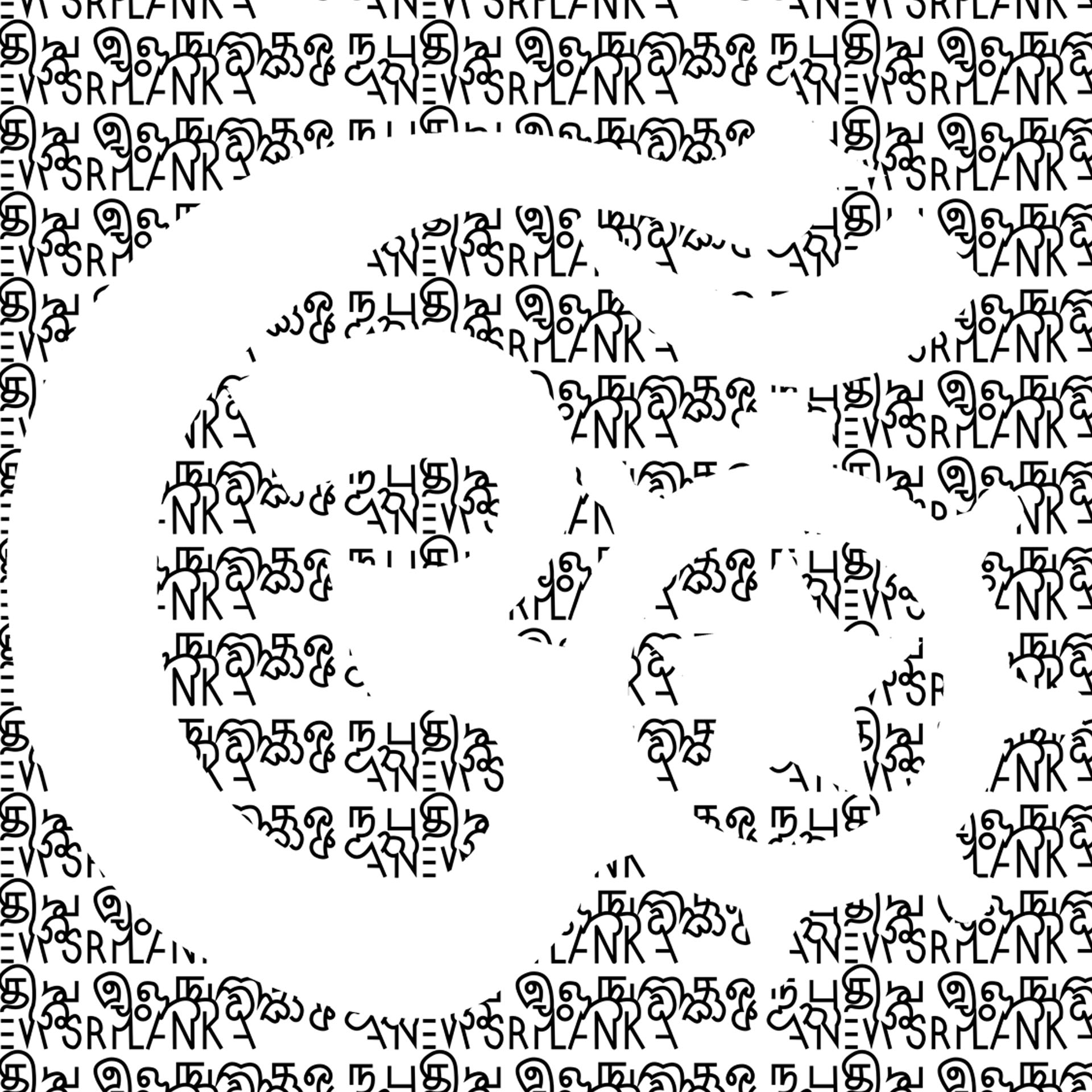
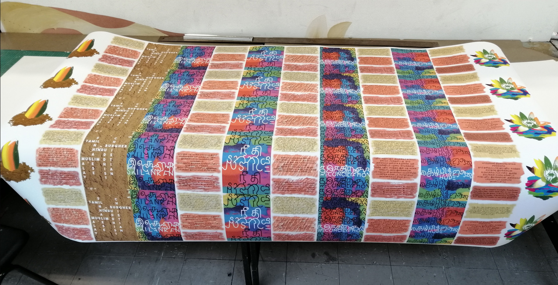
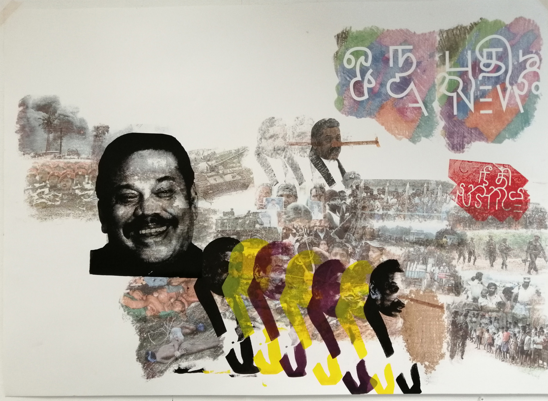
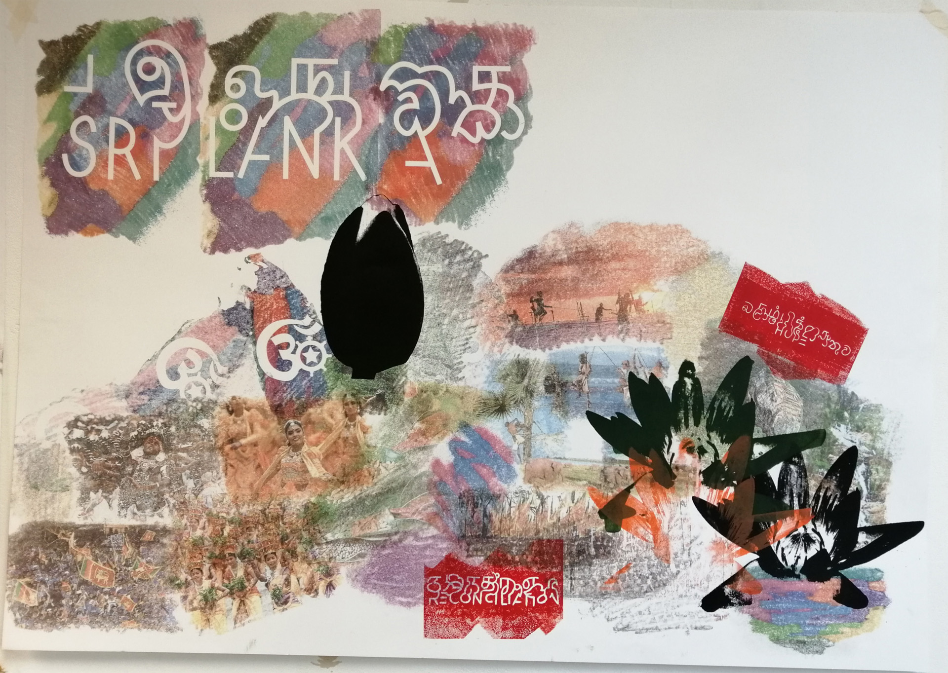
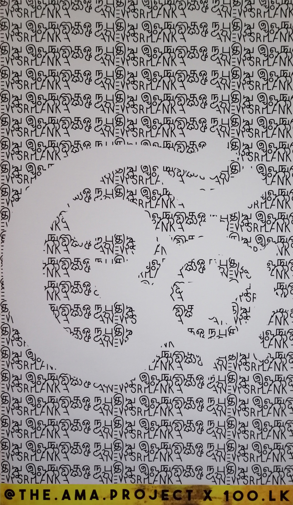
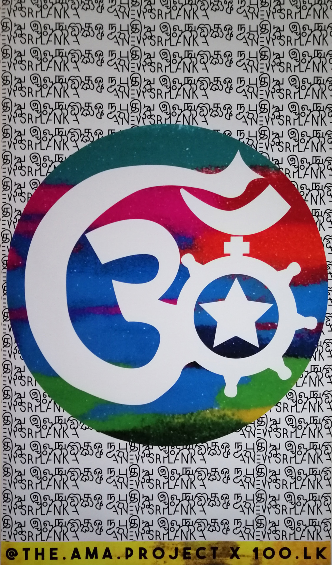
Hi, my name is Amrith Muhundan. This project is all about a utopian ideal for Sri Lanka, a country that still battles with ethnic tensions following the Civil War. In an effort to counter the current narrative of oppression and hatred, I wanted to offer a message of idealism: a hope for a new Sri Lanka. Unity being a key incentive, I merged the three languages of the country to create a custom typeface as well as uniting the religious symbols into a logo. A united symbol and typeface for a united Sri Lanka. Because this topic is so close to my heart I wanted to be as thorough as possible, exploring as many avenues as I could before narrowing down on final concepts. Hoping to incorporate a hybrid aesthetic, I experimented with Eastern and Western art practices, nodding to my Sri Lankan heritage and British upbringing; looking into Sri Lankan art such as silver reliefs, cave paintings, embellishments and cultural decorations, I merged this knowledge with Western application of colour theory and spatial design to be as eclectic as possible. This project very much felt like a self-ethnography into my growing artistic identity.

For more visit:

https://www.instagram.com/the.ama.project/

https://www.flickr.com/photos/192033402@N04/


Amrith Muhundan | Pre-degree & Foundation Studies 5
This project was all about a reconciled Sri Lanka, hence the emphasis on uniting the languages to create a custom typeface and uniting the religions to make a custom logo design.
Amrith Muhundan | Pre-degree & Foundation Studies 4
I printed 5 A5 concertinas, each 12 pages long, with the intent of distributing thereby spreading the message of my campaign.
Amrith Muhundan | Pre-degree & Foundation Studies 1
This mixed media banner piece was very experimental. Combining screen printing, lino and solvent transfers from throughout the project the work acts as precursor for the rest of my final pieces.
Amrith Muhundan | Pre-degree & Foundation Studies
The first A0 sheet focusing on the past and the second looking to the future, acts as a timeline. It illustrates the need to address the past and to look to the future. The need to overcome years of trauma and division and finally unite as a country.
Amrith Muhundan | Pre-degree & Foundation Studies 3
I thought the combination of my typeface and logo design encapsulated this project's motivation. Merging Tamil, Sinhala and English letters as well as all the religious symbols of Sri Lanka, embodied my optimism for a better nation, a sentiment I share with the country's growing Centenary Movement (100.lk).
Amrith Muhundan | Pre-degree & Foundation Studies 2
Stemming from my experimentation into Eastern art practices, I incorporated Rangoli powder to give my work a Sri Lankan flavour; I aimed to merge this vivacious, decorative style with my own, naturally Western, understanding of layout and graphic design.