I am a graphic designer who believes project management software can be beautiful, fun and save my time! I value simplicity in my design works. I strive to compact complex visions and messages into a straightforward piece of work.
Voice of Typeface
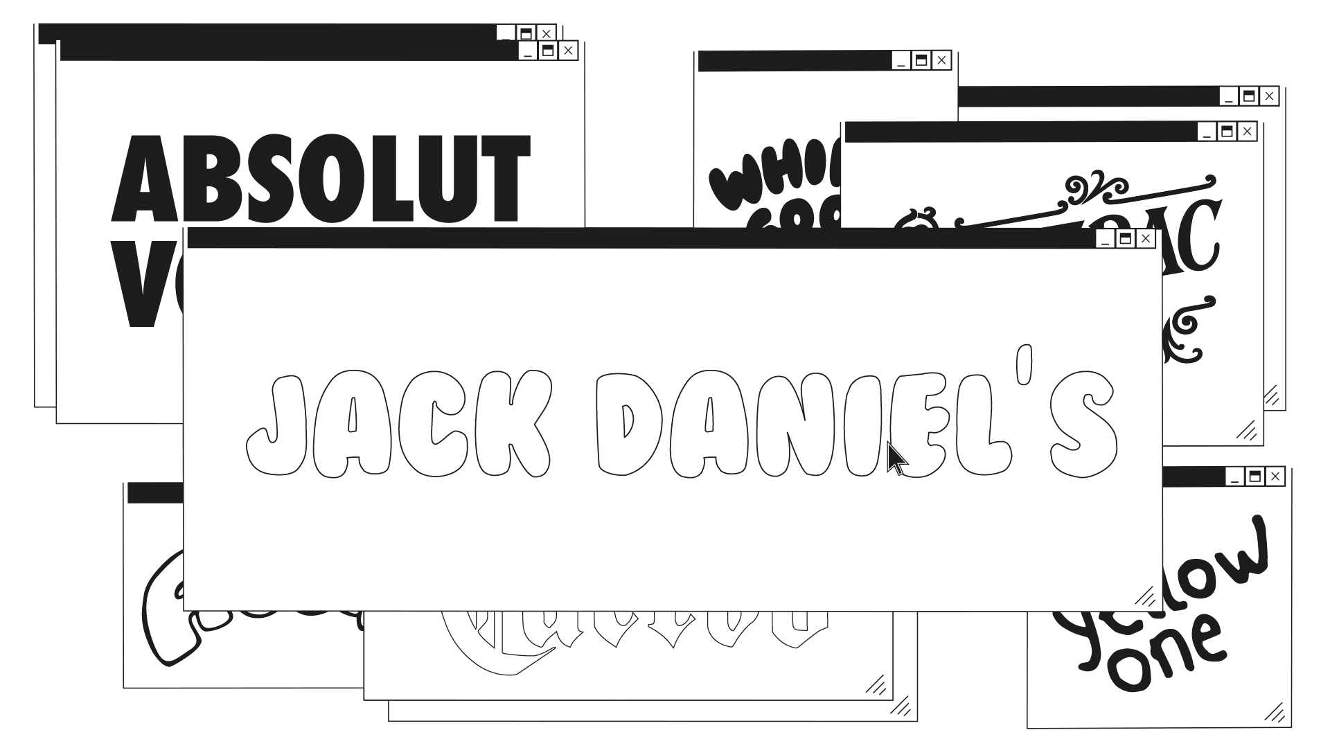
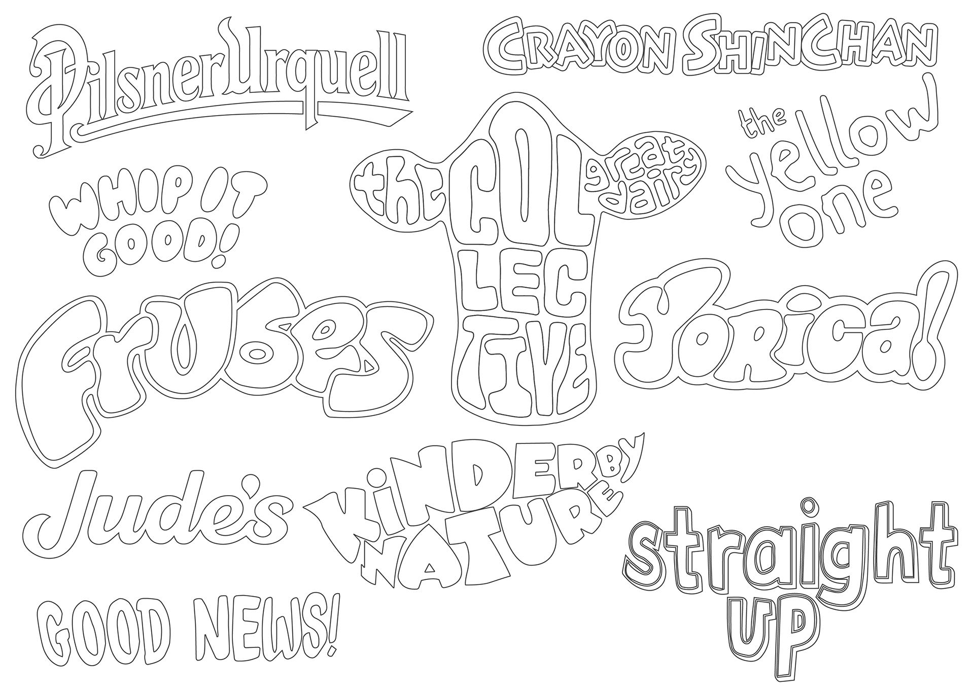
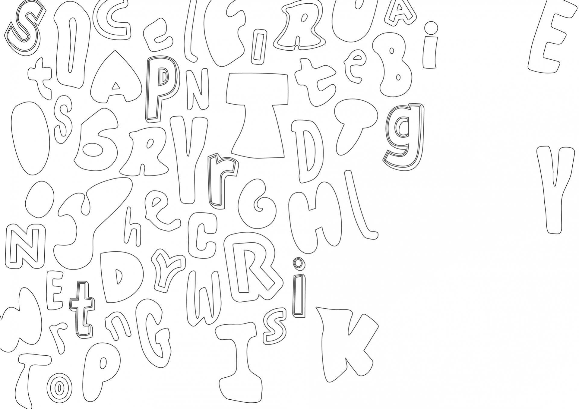
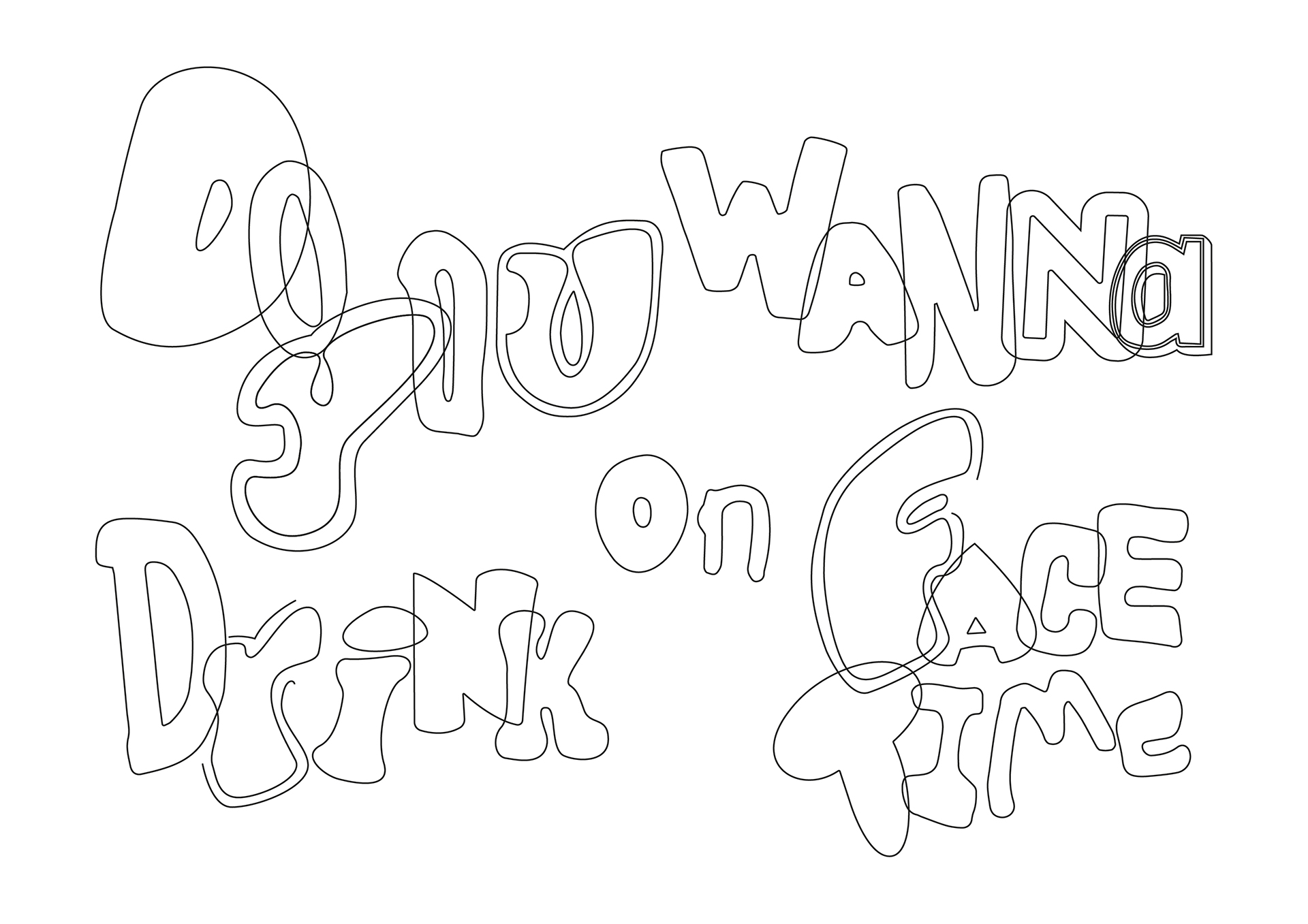
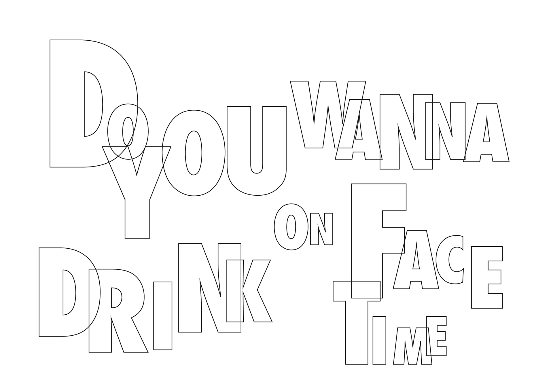
It is amazing how food packaging typography relates to perception. It represents the tone and values of the brand, just like colour represents a feeling or visually represents a message for customers. I realised that the tone of a lot of drinks products is super positive friendly, so I was thinking maybe I can do the opposite, like using a cartoon-ish font on alcoholic drinks. It would look completely wrong and inappropriate but I would like to know how the design gives the audience a pre-conception of what the text/word/product is actually about.
With this project, people would find that the choice of typeface can have a great influence on the information they receive looking at the word.
Email: siewpink_teoh@hotmail.com
LinkedIn: http://www.linkedin.com/in/zxbpink