Creativity has always been at the core of everything I enjoy and my studies over the last year at UCA have helped me identify the particular area in which I wish to specialise, namely Graphic Design and Visual Communication.
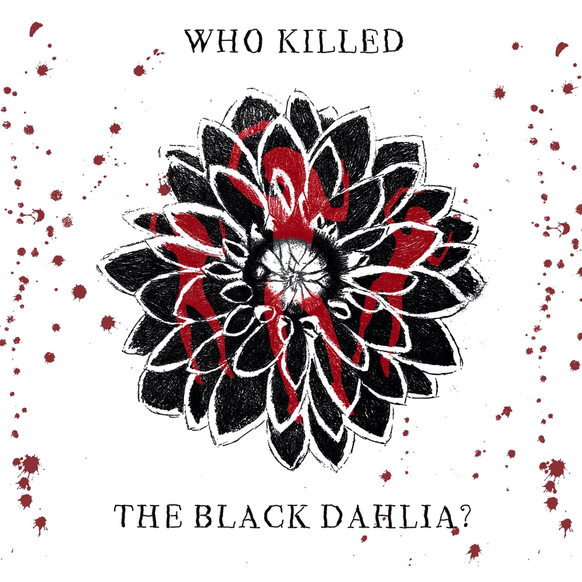
My aim for my final major project was to choose a subject that would not only keep me engaged from a research perspective and provide me with enough material to experiment extensively throughout the 10 weeks, but also provide a visually interesting and informative piece of work that would also keep the reader engaged. I also wanted to choose a subject that was completely different to my last two projects. I narrowed it down to true crime, in which I have a keen interest.
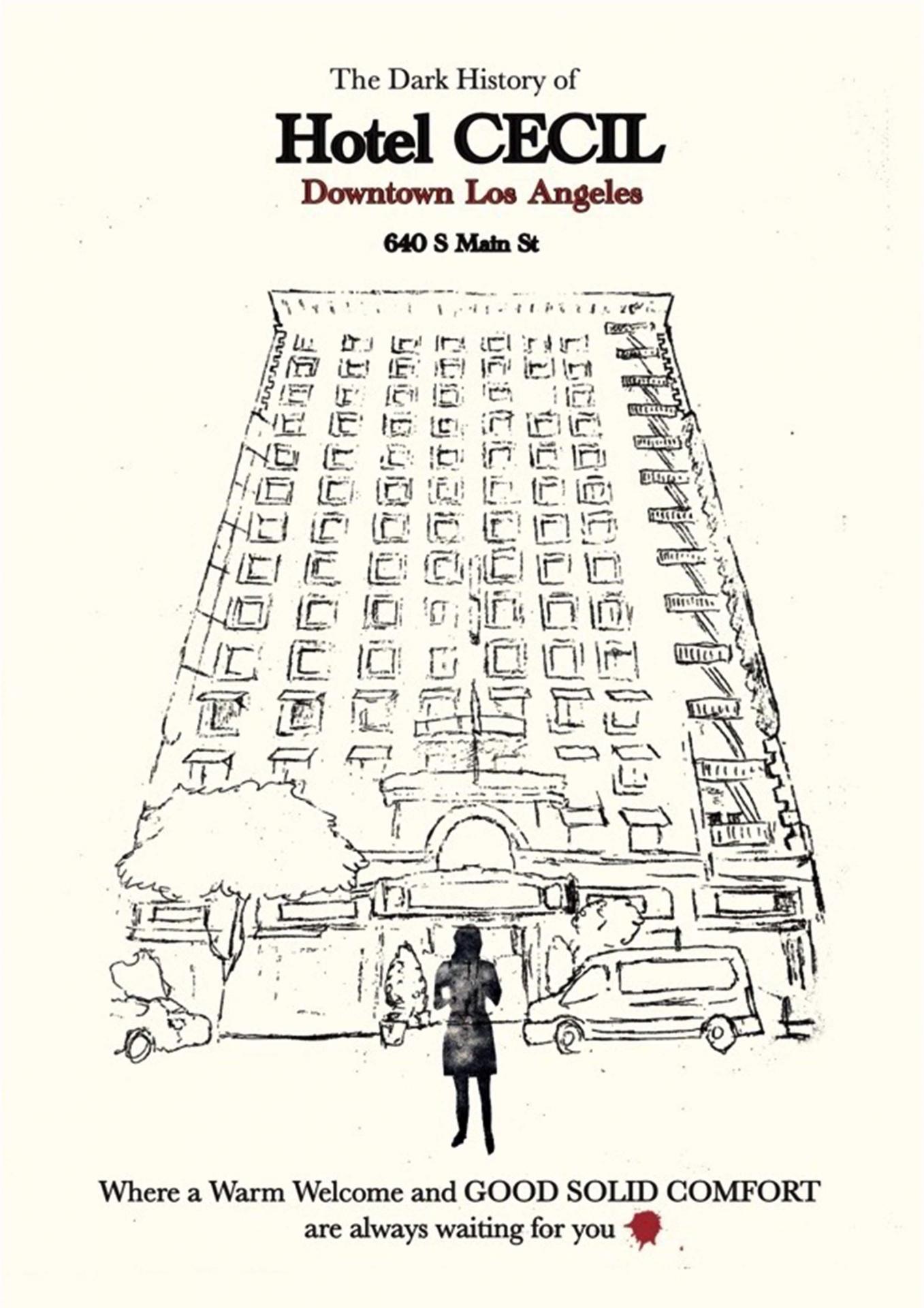
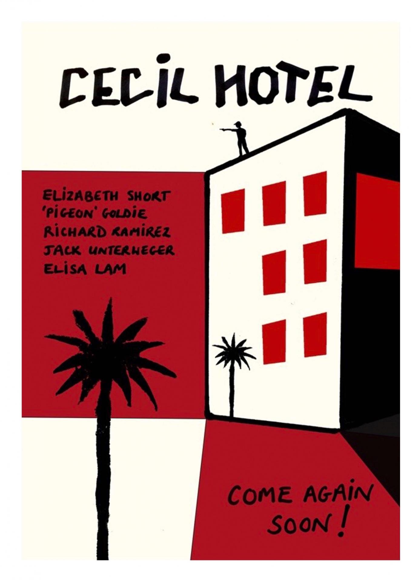
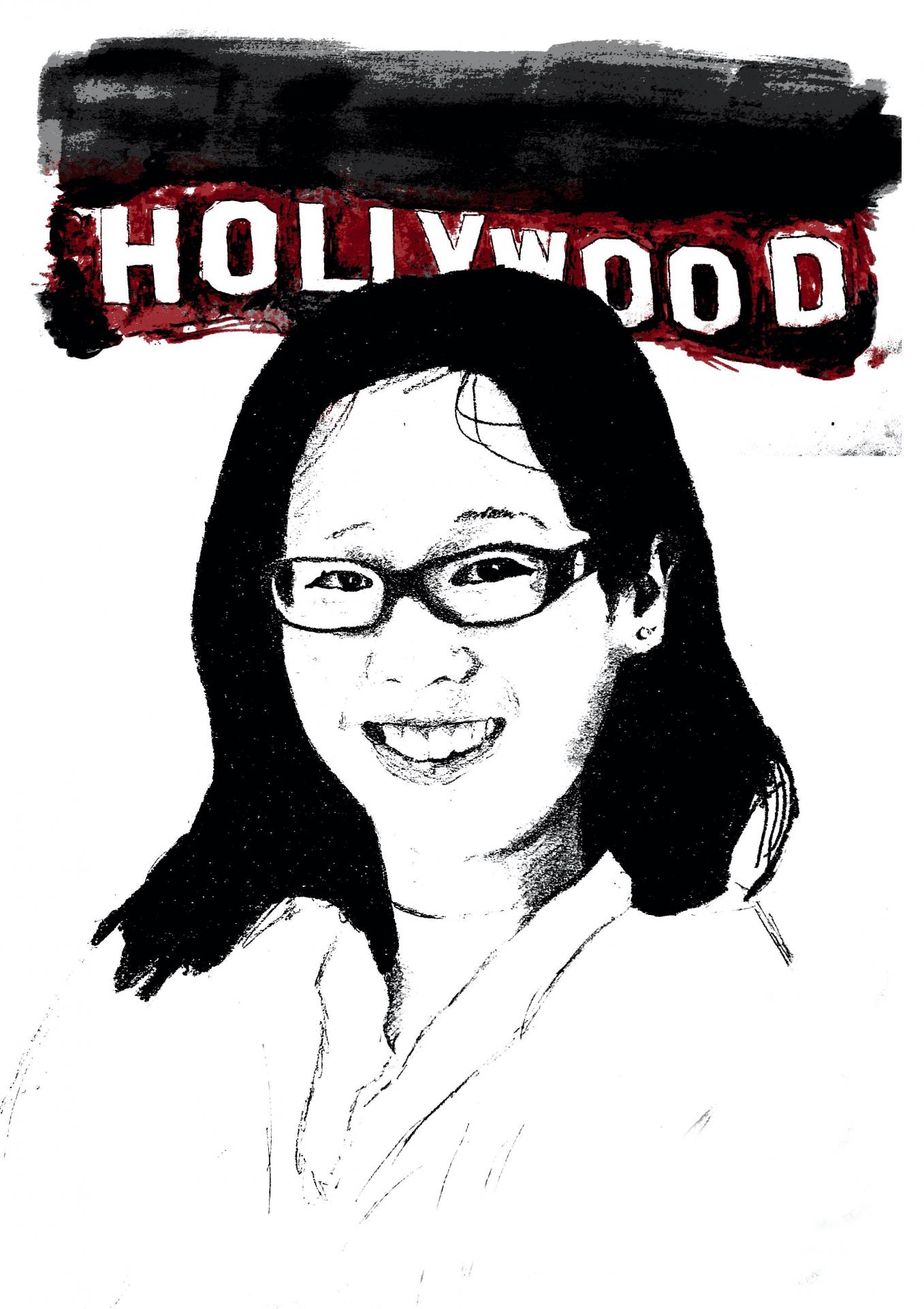
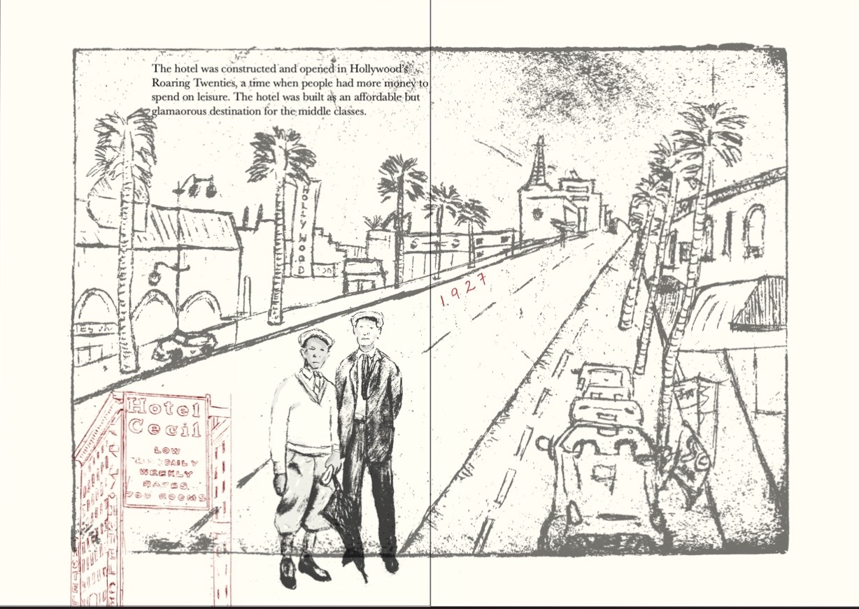
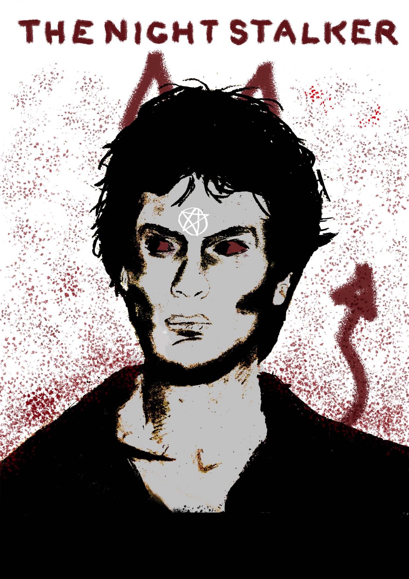
Around the time I was deciding what topic to focus on, I watched, and was fascinated by, a Netflix documentary called ‘The Vanishing at the Cecil Hotel’. It looked at the case of Elisa Lam, a young Canadian woman who had mysteriously disappeared while staying at the hotel in 2013. Her body was tragically later found in one of the water tanks on the roof. The documentary also revealed that this was by no means the only strange and horrible case that was related to the hotel, which is based in downtown Los Angeles. This immediately made me consider focusing the project on the hotel. From watching the documentary and conducting initial research, I felt there was something really unique about the hotel’s dark history and I was keen to explore further. I wanted to create a dark, gloomy atmosphere for my pieces, reflecting the hotel’s horrid past. This meant creating my images in black and white, primarily using pencil and charcoal, to begin with. I found that charcoal was a great material to use. The rough and unpredictable quality combined with the ability to smudge and smear the charcoal assisted in creating dreary snapshots of an era filled with doom and gloom.
When we were allowed back into the studio, I focused on creating my work through drypoints and etchings. These techniques allowed me to create detailed pieces of the hotel. I used Adobe Photoshop to edit my experimentations, often creating a large contrast between the dark and light parts of my images. I found that this made my images even more sinister and dark. Photoshop really allowed me to play with my images, experimenting particularly with colour and adding shades of red to my work. I also began to overlap images and play around with the opacities, being influenced by Jeffrey Decoster, an artist who liked to combine and overlap images and backgrounds, often depicting emotional situations that told a story.